My role
UX/UI Designer
Duration
4 weeks
Tools
- Figma
- Google forms
- Notion
About Project
This project focuses on redesigning the sign-up and onboarding flow for a mobile banking app's digital wallet. The goal was to take new users from download to a verified account quickly and confidently, using plain language instead of banking jargon, clear security cues at every step, and a shorter identity verification (KYC) process. I worked as the UX/UI designer over four weeks, from understanding where new users were getting stuck through to user flows, wireframes and a high-fidelity prototype in Figma.
Problem Statement
New users often feel confused and frustrated during the digital wallet sign-up process due to unclear terminology, a lack of trust signal and security cues, as well as a lengthy onboarding process that requires more than 2 minutes to go through.
The Solution
Design a clear, user-friendly mobile wallet login and onboarding experience that simplifies language, guides users step-by-step, and clearly communicates required information; ultimately improving completion rates and reducing user frustration.
Project Timeline
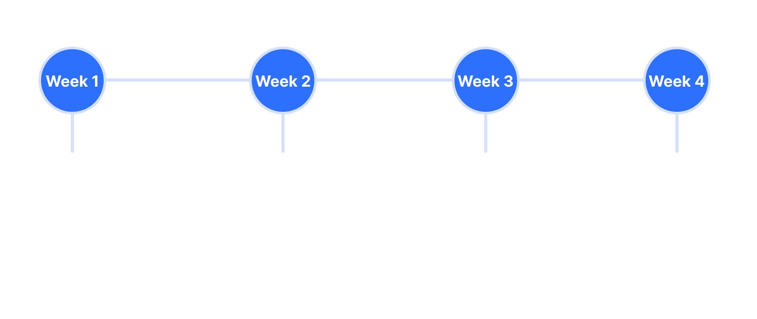
Four weeks from research to tested design: competitive analysis and a user survey first, affinity mapping to pin down the problem, then flows, wireframes and testing, and finally refining and re-testing the finished flow.
Key Priorities
- P1 Reduce terminology confusion, making sure the jargon used is understandable by users.
- P2 Display trust signals and security cues, ensure users feel safe and secure throughout the process.
- P3 Streamline the KYC process making it less time consuming.
User Personas
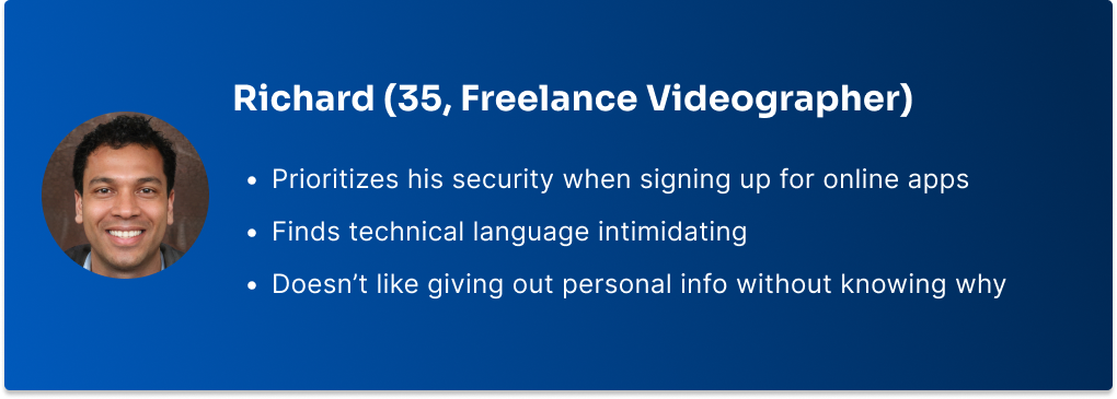
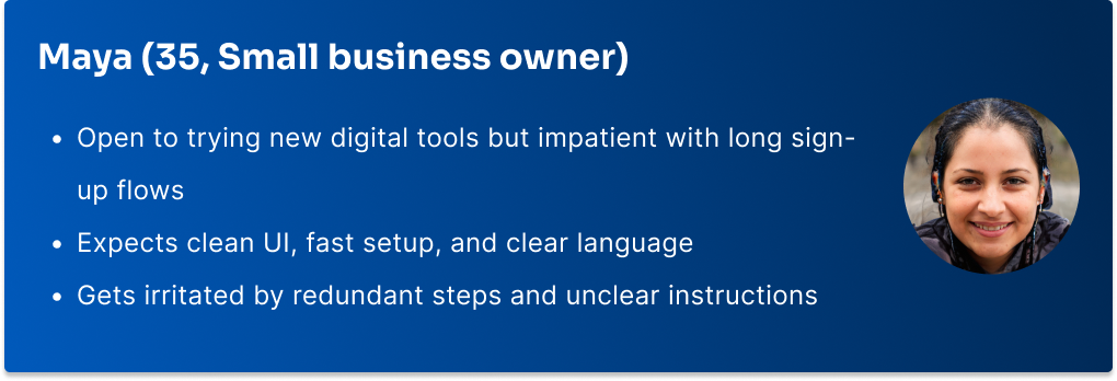
Richard puts security first and is put off by technical language, so every request for personal details explains why it's needed. Maya has no patience for long sign-ups, which led to a progress bar on each step and letting people skip extras like biometric login and two-factor authentication.
User Flow
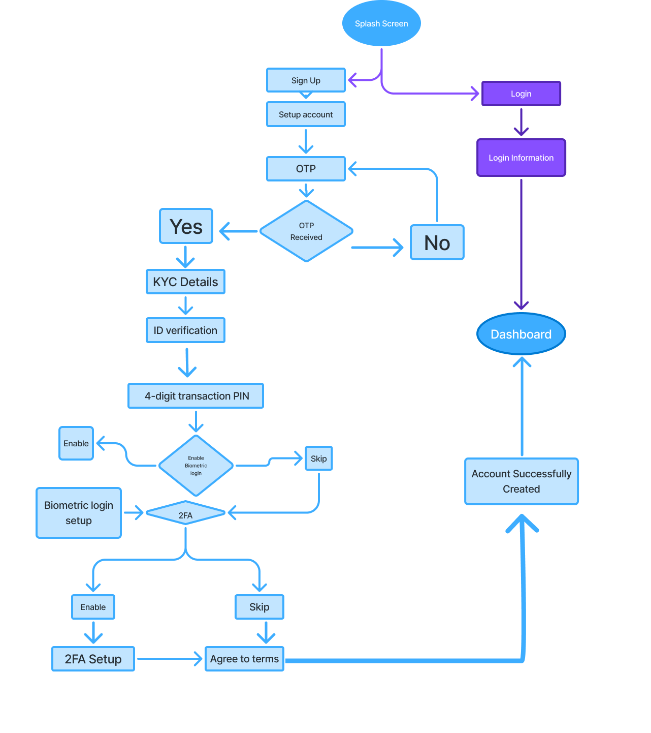
New users go from sign-up through a one-time code, identity details, ID upload and a transaction PIN. Biometric login and two-factor authentication are optional, so security-minded users can opt in without slowing everyone else down.
Lofi Wireframes
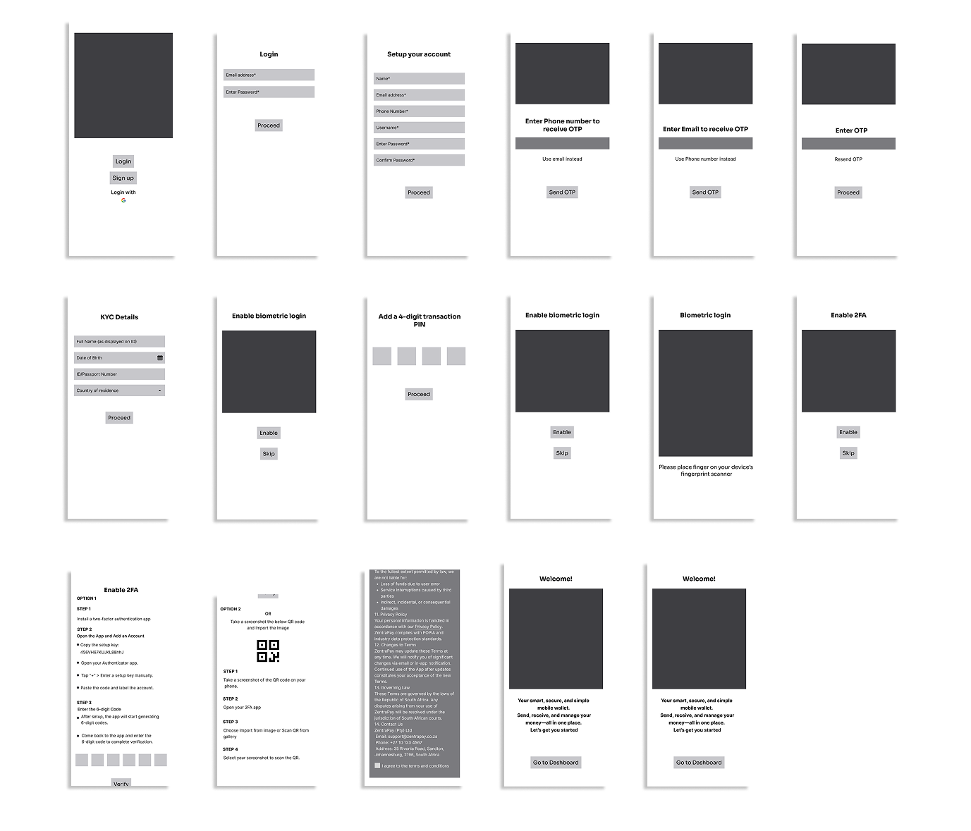
Low-fidelity wireframes mapped every screen of the flow before any visual design, including the choice to receive the one-time code by phone or email.
Final Hi-Fi Designs
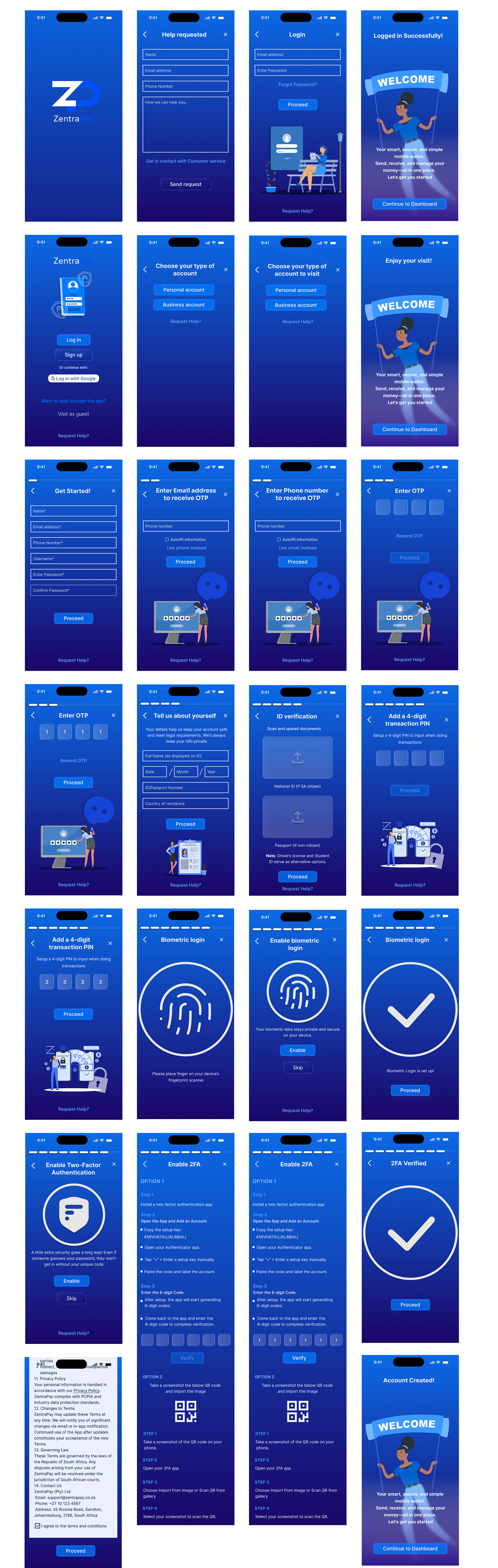
The final designs add a progress bar to each sign-up step, plain-language notes on why details are needed, a "Request Help?" link on every screen, and a guest option for people who want to look around before committing.
Usability Testing
I tested the prototype flow with about 15 people, asking each of them to sign up and complete onboarding on their own.
Final Thoughts
This project taught me that onboarding friction is as much about words and trust as it is about the number of screens. Plain language instead of banking jargon, a clear reason for every piece of personal information we asked for, and a visible sense of progress were the core of the redesign, and 90% of the people who tested the flow finished it without any help.
What I'd do differently: I would run a more thorough round of prototype testing that covers every path through the flow — logging in, visiting as a guest and the optional security steps, not just the main sign-up — so each branch could be iterated on with real evidence rather than assumptions.