My role
UX Designer
Duration
4 weeks
Tools
- Figma
About Project
This project focuses on designing the prescription ordering flow for the Ekuphileni Clinic app. Whilst the app also allows patients to book doctor appointments and schedule house calls, the primary goal of this project was to create a simple, intuitive and seamless experience for ordering and paying for prescriptions, ensuring that even patients who are severely ill can order and pay for their medication from home, then simply collect it once it is ready. The project was taken to a clickable, high-fidelity prototype; the app itself was not built.
I worked as the UX designer alongside a UI designer. The UI designer owned the layout, colour and typography. I designed the flows and made sure the interface matched the abilities of the people the app is for — elderly and ill patients — so that every step stays easy to read, understand and complete.
Problem Statement
Severely ill patients struggle to access timely healthcare due to limited mobility and overburdened hospital systems. Many cannot leave their homes, and when they do, they often face unavailable doctors or packed schedules. This leaves patients without essential treatment and creates a pressing demand for more accessible, efficient, and reliable medical care solutions.
The Solution
Patients need a reliable way to get their medication without long, uncertain waits at the clinic, especially when they are severely ill. Our solution focuses on designing a seamless prescription ordering flow within the Ekuphileni Clinic app. This flow allows patients to easily order and pay for their prescriptions from home, then collect them at the clinic once they are ready, turning a long wait into a quick pickup. For patients who can't leave home, a family member or caregiver can collect the order on their behalf. While the app also supports booking appointments and scheduling home visits, the primary emphasis of this project is ensuring that the prescription ordering experience is fast, clear, and convenient for patients who need timely access to their medication.
Research
We ran a survey with people at the clinic to understand the patients the app would serve. It kept the design focused on the people who need it most: elderly and ill patients.
Design Process
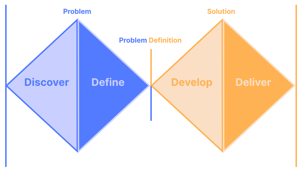
I followed the Double Diamond: discover and define the problem first, then develop and deliver the solution.
Key Priorities
- P1 Design a purchasing flow that users can seamlessly navigate through without friction and successfully order their prescriptions.
- P2 Match the interface to the abilities of elderly and ill patients, so every step is easy to read, understand and complete.
User Personas
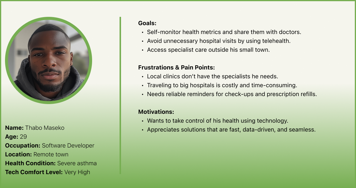
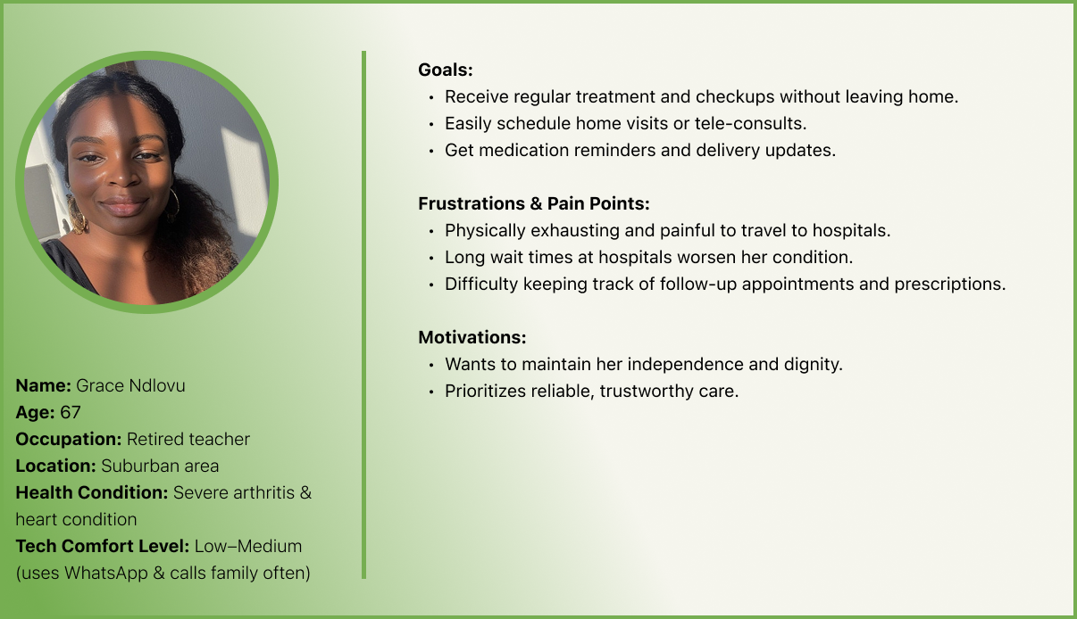
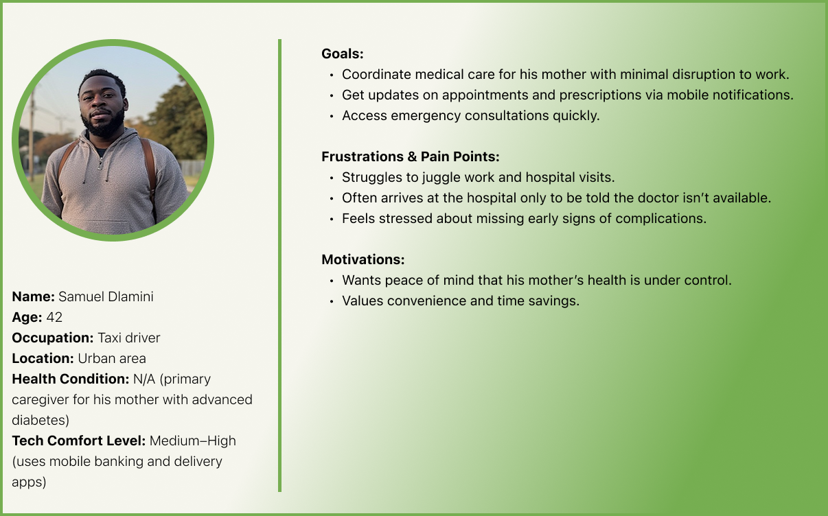
Three personas covered the people the app serves: Thabo, a tech-confident patient in a remote town; Grace, 67, who finds travel painful and has low-to-medium comfort with technology; and Samuel, who manages his mother's care around work. Grace set the bar: if the flow worked for her, it worked for everyone.
User Flow
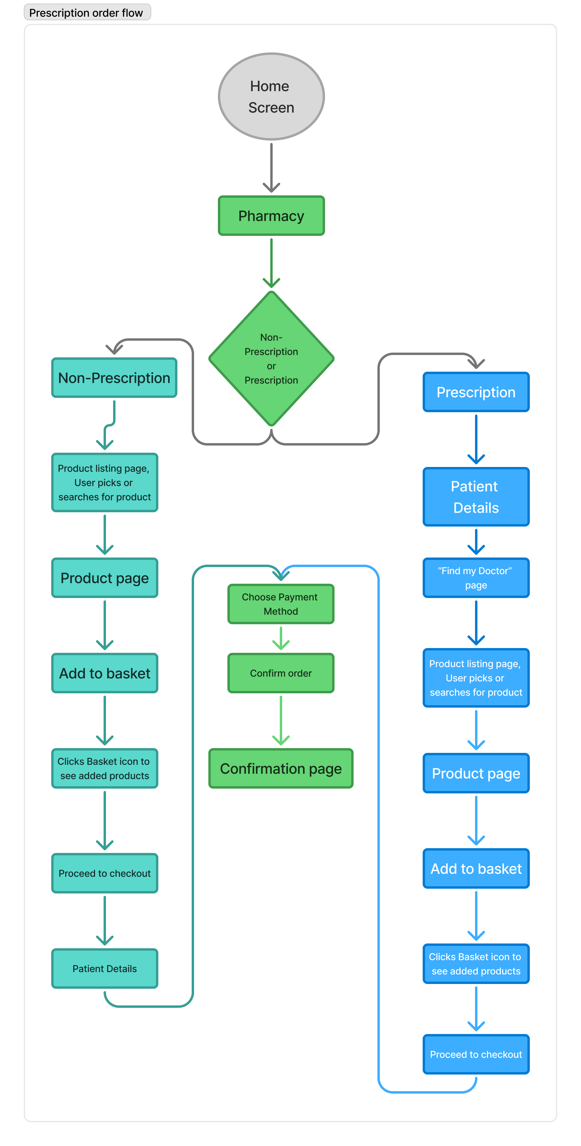
From the pharmacy, patients choose prescription or non-prescription medicine. Prescriptions add patient details and the prescribing doctor before picking products; both paths then meet at the same payment and confirmation steps.
Wireframes
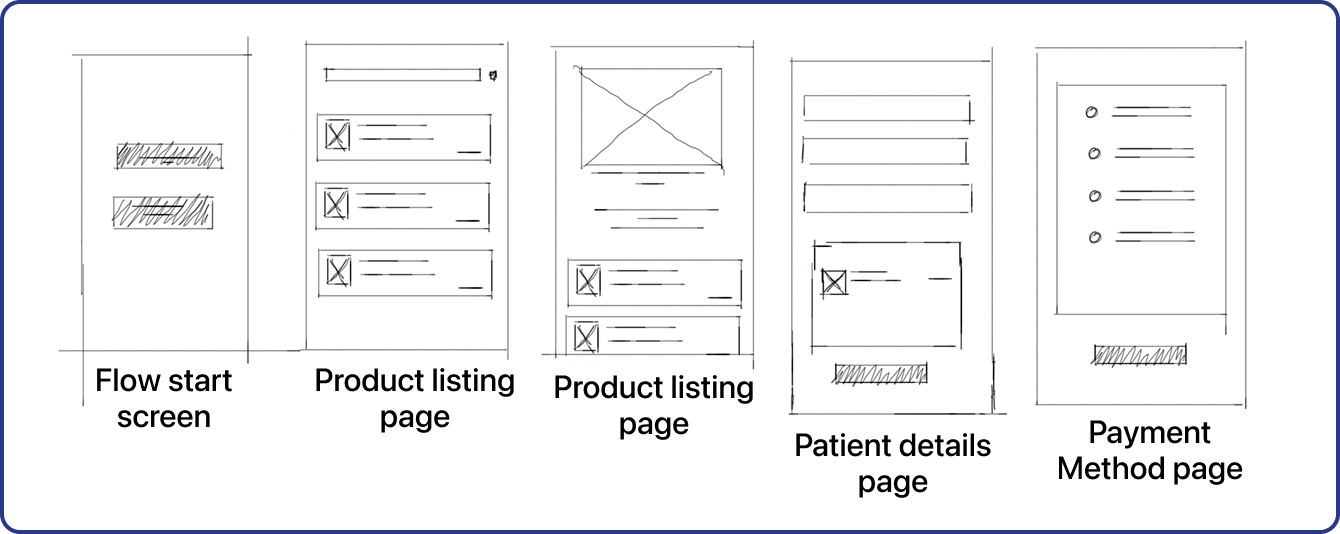
Quick hand sketches of the key screens: the starting choice, product listings, patient details and payment method.
Final Hi-Fi Designs
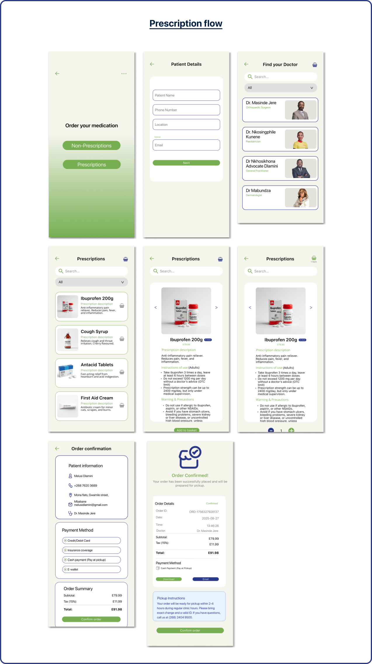
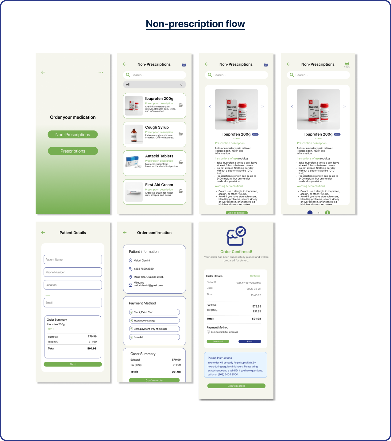
The final prescription and non-prescription flows: one clear choice to start, a searchable product list, an order summary before payment, and four ways to pay, including cash and insurance. The confirmation screen gives clear pickup instructions and the clinic's phone number.
Final Thoughts
Designing for elderly and ill patients taught me that accessibility isn't a layer you add at the end; it shapes the flow itself. When someone is managing pain, fatigue or anxiety, every extra step or unclear label costs them more. Working alongside the UI designer, my job was to make sure each step stayed easy to read, understand and complete for someone like Grace, not just for a confident user like Thabo.
What I'd do differently: the project ended at a clickable prototype. I'd want to build it fully and test it in the field with real patients at the clinic, to see how the flow holds up for people who are unwell, in a hurry, or less used to their phones.